i have no idea why this is a goddamn story,
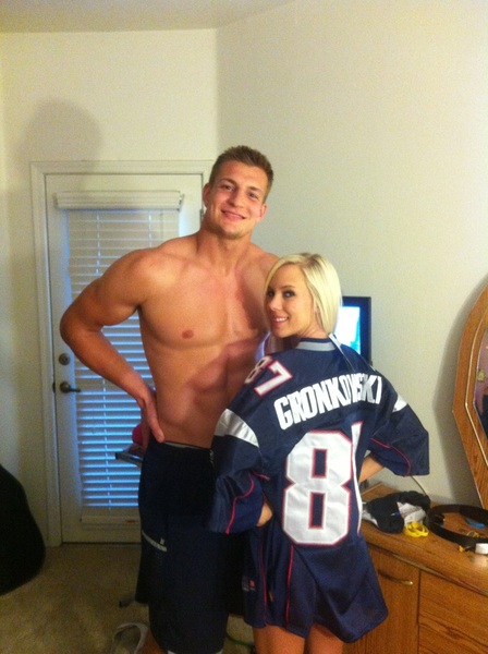
but bob kraft is pissed off at rob gronkowski
why? because he took a photo [yes, it's sfw] with a porn actress [relax, it's to espn]
those of us with any semblance of maturity will probly respond with "...so?"
but i must remind you folks, and i cannot stress this enough
bob kraft has no such sense
in all his years as owner of the patriots [full since '94, partial since '85],
he's been prone to childish and boorish behavior
partially because he's, ya know, bob kraft
so this whole 'blown out of proportion' thing shouldn't come as a surprise
the short version of this latest debacle is this:
gronkowski went to the university of arizona,
said porn start [bibi jones] went to the self–same university,
and apparently they have a mutual friend or two
since porn stars are regular people two, bibi's a fan of football
[or, at the very least, a fan of his]
so they posed for a couple photos while they were both in arizona,
and she posted them to her twitter account
because [unsurprisingly] she has more followers than he does
i dunno about you guys,
but i think his only lapse in judgment is the way he posed
he kinda looks like a broski douchebag
which seems to be a recurring theme
in other news, i find myself in a listy mood
i also find myself wanting to talk about football again
so, in the spirit of compromise, i'll do both
cuz who doesn't love a nice, clear cut, rage inducing list?
so let's get to it
today i shall be presenting the 10 best college logos, but with a twist:
no words, no letters, just actual logos [so no block m, no ou, no block s, &c]
why, you might ask?
because i appreciate and value creativity,
and what better way to show it by having an instantly recognizable symbol?
so, i took a good hard romp through division 1 [fbs and fcs]
to bring you the best non–word logos
[note: i will be including logos that include words if they are also used without
for example, missouri's logo is used both with and without the block m
thus, i could include the second one (even though it has writing at the bottom)
also, if a logo includes writing in it, but it is not the focal point of the logo,
it will also be considered a straight up logo (like maryland]
WITHOUT FURTHER ADO:
honorable mentions:
siu edwardsville, southeastern louisiana, niu, youngstown state, and eastern washington
chances are that you haven't seen most of these logos before,
but that doesn't diminish their value
sometimes the best things languish in obscurity,
and that certainly holds true for these logos
siu e's logo is really slick, surprisingly so for such a small school [it's a cougar, btdubs]
s/e louisiana's is by far the best lion logo i've seen in division I
i give niu props because their husky is not only stylized,
it actually looks like the animal it's supposed to be
[as opposed to, say, kansas state's wildcat or delaware's hen]
eastern washington took a cue from wazzu and made their logo their acronym,
but they managed to make theirs look better
and finally, how can you not love a school who's mascot is a penguin?
especially one wearing a scarf and hat?
DA LIST:
#10 – san jose state
again, this is a logo you may not have seen before
but damn does it look cool
i think it's the mix of influence and originality that does it for me
there's obviously a little bit of influence from usc and msu in there
[especially since they made this iteration in 2000]
but they also took strides to make it their own,
like giving it sharper, more precise edges, and using both colors in the plume
the only real downside for sjsu is that their teams aren't particularly notable
which means they don't have much brand recognition
so for now, they'll have to take comfort in knowing their logo is bitchin'
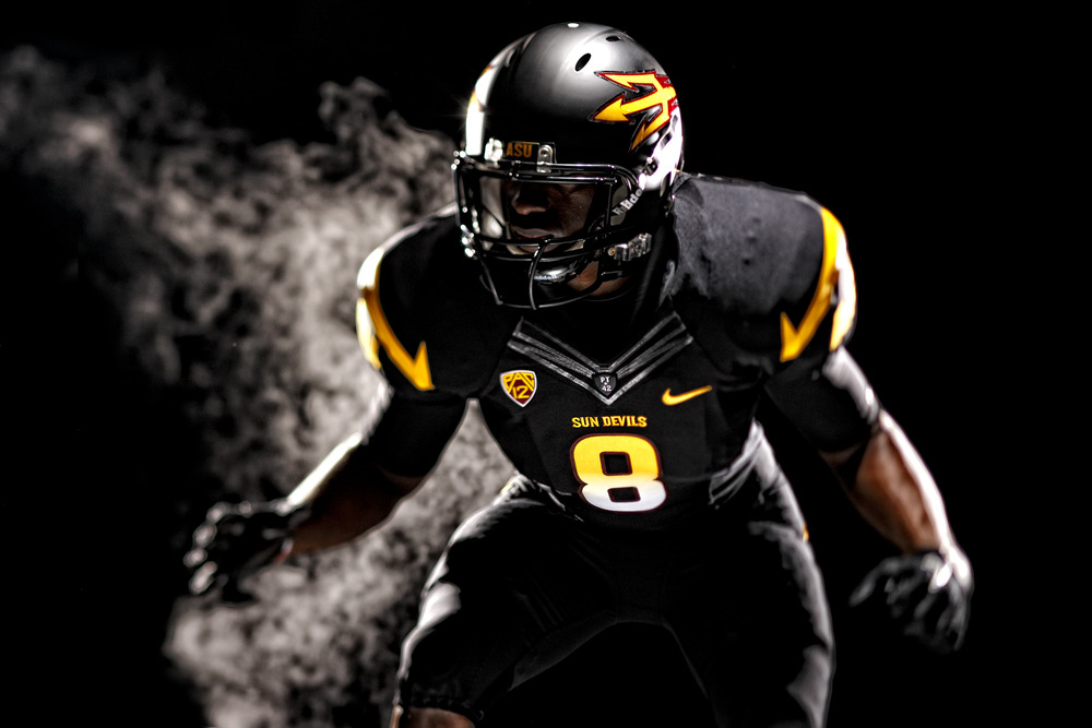
#9 – arizona state
of all the redone logos of the past decades,
arizona state's is, in my opinion, the most successful
the previous sparky logo was really just kinda weird [and that mustache? creepy]
but the new trident is just sweet
what makes it work it is that they based it on a simple design,
and didn't go nuts with the embellishments
plus, they went back to a two–color scheme, which makes it much easier on the eyes
[cuz more colors can be a bit much, right florida and uab?
overall, it's a sleek design that'll go a long way
plus, it looks BADASS on their new football uniforms
#8 – usf
i've always been a sucker for cleverly used letters and words in logos,
and this one is by far one of the very best
it's not exactly subtle, but it looks great, and that's all you can really hope for
i think what makes it so good is the fact that they didn't anthropomorphize the bull
they could've made it more bull–like like buffalo,
[which, by the way, is a great logo in its own right]
but i think they made the right choice in encorporating the 'u'
in a league with such bland logos as syracuse and rutgers
usf's really stands out
plus, if usf football keeps it's meteoric rise going
we're gonna start seeing it everywhere
#7 – mizzou
regardless of what league or sport you follow
there is no lack of sports teams with tiger logos
which means that we are flooded with every stupid tiger logo ever made
but the one that always stood out to me was mizzou's
first off, it actually looks like a tiger
and secondly, it actually looks good
those two characteristics are notably lacking in most of the other tigers
plus, it looks like it's out for blood
[as opposed lsu's old one, which looks vaguely retarded
or memphis's, which looks like it's playing with something]
i have a little less to say about this one than the others,
but my liking mainly comes down to the fact that it just works
#6 – uconn
again, there are a number of huskies in the world of sports
but none so iconic as that beautiful blue husky of uconn
every college basketball fan in the country knows this logo,
especially during my lifetime,
in which men's/women's teams won 8 of the last 13 national championships
which is fucking absurd [in the good way]
the husky itself is a just a great work of art
they kept the stylizing muted, they bucked the trend of 'angry eyes'
[which has gotten RIDICULOUS in the past ten years
in what universe to dolphins, ducks, and chickens have angry eyes?]
and they threw in a nice splash of red to accent the blue and white
maybe it's because i was born and raised a huskies fan,
but uconn has one of the best animal logos out there
#5 – florida state
this logo is my main reason for involving that exception of included writing
cuz what greatest logos list would be complete without the seminoles?
college football fans will immediately recognize this one,
thanks in no small part to fsu's reign of dominance in the '90s
the screaming seminole is as cool as it is uniquethe facepaint, the hair feather with the school name
and the incorporation of the colors combine to make a really sweet look
plus, the more unique a logo is, the more it sticks in your mind
and instant recognition goes a long way towards distinguishing good from great
it was also one of the only native american logos to survive the ncaa axe
[unlike chief illinwek and the fighting sioux]
leaving florida state as one of the only remaining acceptable logos
and i, for one, and sure glad they did
#4 – southern california
reticent as i am to admit it,
usc's trojan makes it here by virtue of it's exceptional athletic history
every football fan has seen this logo at some point,
probly during a usc beatdown of their favorite team
its been that way since the early 1970s
and has had some of the best staying power of any college logo
it's design can be a bit dizzying at times [especially if you stare at it too long]
but there's no getting by the classic design
it really raised the bar in logo design
and it's influence can be seen in any number of helmet logos to this day
hard to beat a pedigree like that
#3 – michigan state
again, this may be a little bit biased
but again, it's one that college basketball fans will instantly recognize
along with an ever–growing college football fanbase
what makes the spartan helmet work so well is the clean-cut design:
one color, sharp edges, and a simple design with a few well–chosen stylish accents
[and, by the way, it looks just as good in white
the only other logo i can think of that looks good in two different colors is iowa]
it stands out in a way that few logos do,
AND it's one of the oldest helmet logos still in use
in fact, the original spartan helmet was created in 1965
a full six years before the usc trojan
[i have no idea if msu's influenced the creating of usc's at all,
but in my own mind, i like to think it did]
and this one's been in use since 1977
and there's just no escaping its brilliance
#2 – clemson
i have to put clemson high on this,
because seriously, this logo is fucking brilliant
while other colleges spent their time and energy making weird looking tigers,
clemson decided one up them all and use an actual tiger to make theirs
they took a mold of a paw print from tiger at a nearby zoo,
and used that as the basis for their logo
and i gotta say, it looks great
even with all the little lines around the edges of the print,
it's simple design makes it one of the best
everyone and their brother has used this logo at some point it seems
even mid michigan youth football programs have it on their helmets
if imitation is the sincerest form of flattery,
then clemson should feel pretty goddamn flattered
#1 – penn state
yup, i did it
i forewent texas, florida, kansas state, and iowa for the nittany lions
and i don't give a shit
if you've watched college football in the past EVER, you know this logo
even if you're only a casual observer, you've seen it crop up
and damn is it a good one
like the best designs, it uses only two colors
and the design is simple with a few choice embellishments
it's far and away the best big cat logo out there,
[which does actually put it up against some stiff competition]
and represents one of the most visible and well–known athletic schools
couple all that with being unchanged for the past 30 years,
and you've got yourself a winning formula
for me, there is no other number one but penn state
[btdubs, this list took a metric shit–tonne of time to put together
i think i might've set a personal record with it
i started it four days ago]
LET IT [the screaming] BEGIIIIIIIIIIIIIIIN!
but bob kraft is pissed off at rob gronkowski
why? because he took a photo [yes, it's sfw] with a porn actress [relax, it's to espn]
those of us with any semblance of maturity will probly respond with "...so?"
but i must remind you folks, and i cannot stress this enough
bob kraft has no such sense
in all his years as owner of the patriots [full since '94, partial since '85],
he's been prone to childish and boorish behavior
partially because he's, ya know, bob kraft
so this whole 'blown out of proportion' thing shouldn't come as a surprise
the short version of this latest debacle is this:
gronkowski went to the university of arizona,
said porn start [bibi jones] went to the self–same university,
and apparently they have a mutual friend or two
since porn stars are regular people two, bibi's a fan of football
[or, at the very least, a fan of his]
so they posed for a couple photos while they were both in arizona,
and she posted them to her twitter account
because [unsurprisingly] she has more followers than he does
i dunno about you guys,
but i think his only lapse in judgment is the way he posed
he kinda looks like a broski douchebag
which seems to be a recurring theme
in other news, i find myself in a listy mood
i also find myself wanting to talk about football again
so, in the spirit of compromise, i'll do both
cuz who doesn't love a nice, clear cut, rage inducing list?
so let's get to it
today i shall be presenting the 10 best college logos, but with a twist:
no words, no letters, just actual logos [so no block m, no ou, no block s, &c]
why, you might ask?
because i appreciate and value creativity,
and what better way to show it by having an instantly recognizable symbol?
so, i took a good hard romp through division 1 [fbs and fcs]
to bring you the best non–word logos
[note: i will be including logos that include words if they are also used without
for example, missouri's logo is used both with and without the block m
thus, i could include the second one (even though it has writing at the bottom)
also, if a logo includes writing in it, but it is not the focal point of the logo,
it will also be considered a straight up logo (like maryland]
WITHOUT FURTHER ADO:
honorable mentions:
siu edwardsville, southeastern louisiana, niu, youngstown state, and eastern washington
chances are that you haven't seen most of these logos before,
but that doesn't diminish their value
sometimes the best things languish in obscurity,
and that certainly holds true for these logos
siu e's logo is really slick, surprisingly so for such a small school [it's a cougar, btdubs]
s/e louisiana's is by far the best lion logo i've seen in division I
i give niu props because their husky is not only stylized,
it actually looks like the animal it's supposed to be
[as opposed to, say, kansas state's wildcat or delaware's hen]
eastern washington took a cue from wazzu and made their logo their acronym,
but they managed to make theirs look better
and finally, how can you not love a school who's mascot is a penguin?
especially one wearing a scarf and hat?
DA LIST:
#10 – san jose state
again, this is a logo you may not have seen before
but damn does it look cool
i think it's the mix of influence and originality that does it for me
there's obviously a little bit of influence from usc and msu in there
[especially since they made this iteration in 2000]
but they also took strides to make it their own,
like giving it sharper, more precise edges, and using both colors in the plume
the only real downside for sjsu is that their teams aren't particularly notable
which means they don't have much brand recognition
so for now, they'll have to take comfort in knowing their logo is bitchin'
#9 – arizona state
of all the redone logos of the past decades,
arizona state's is, in my opinion, the most successful
the previous sparky logo was really just kinda weird [and that mustache? creepy]
but the new trident is just sweet
what makes it work it is that they based it on a simple design,
and didn't go nuts with the embellishments
plus, they went back to a two–color scheme, which makes it much easier on the eyes
[cuz more colors can be a bit much, right florida and uab?
overall, it's a sleek design that'll go a long way
plus, it looks BADASS on their new football uniforms
#8 – usf
i've always been a sucker for cleverly used letters and words in logos,
and this one is by far one of the very best
it's not exactly subtle, but it looks great, and that's all you can really hope for
i think what makes it so good is the fact that they didn't anthropomorphize the bull
they could've made it more bull–like like buffalo,
[which, by the way, is a great logo in its own right]
but i think they made the right choice in encorporating the 'u'
in a league with such bland logos as syracuse and rutgers
usf's really stands out
plus, if usf football keeps it's meteoric rise going
we're gonna start seeing it everywhere
#7 – mizzou
regardless of what league or sport you follow
there is no lack of sports teams with tiger logos
which means that we are flooded with every stupid tiger logo ever made
but the one that always stood out to me was mizzou's
first off, it actually looks like a tiger
and secondly, it actually looks good
those two characteristics are notably lacking in most of the other tigers
plus, it looks like it's out for blood
[as opposed lsu's old one, which looks vaguely retarded
or memphis's, which looks like it's playing with something]
i have a little less to say about this one than the others,
but my liking mainly comes down to the fact that it just works
#6 – uconn
again, there are a number of huskies in the world of sports
but none so iconic as that beautiful blue husky of uconn
every college basketball fan in the country knows this logo,
especially during my lifetime,
in which men's/women's teams won 8 of the last 13 national championships
which is fucking absurd [in the good way]
the husky itself is a just a great work of art
they kept the stylizing muted, they bucked the trend of 'angry eyes'
[which has gotten RIDICULOUS in the past ten years
in what universe to dolphins, ducks, and chickens have angry eyes?]
and they threw in a nice splash of red to accent the blue and white
maybe it's because i was born and raised a huskies fan,
but uconn has one of the best animal logos out there
#5 – florida state
this logo is my main reason for involving that exception of included writing
cuz what greatest logos list would be complete without the seminoles?
college football fans will immediately recognize this one,
thanks in no small part to fsu's reign of dominance in the '90s
the screaming seminole is as cool as it is uniquethe facepaint, the hair feather with the school name
and the incorporation of the colors combine to make a really sweet look
plus, the more unique a logo is, the more it sticks in your mind
and instant recognition goes a long way towards distinguishing good from great
it was also one of the only native american logos to survive the ncaa axe
[unlike chief illinwek and the fighting sioux]
leaving florida state as one of the only remaining acceptable logos
and i, for one, and sure glad they did
#4 – southern california
reticent as i am to admit it,
usc's trojan makes it here by virtue of it's exceptional athletic history
every football fan has seen this logo at some point,
probly during a usc beatdown of their favorite team
its been that way since the early 1970s
and has had some of the best staying power of any college logo
it's design can be a bit dizzying at times [especially if you stare at it too long]
but there's no getting by the classic design
it really raised the bar in logo design
and it's influence can be seen in any number of helmet logos to this day
hard to beat a pedigree like that
#3 – michigan state
again, this may be a little bit biased
but again, it's one that college basketball fans will instantly recognize
along with an ever–growing college football fanbase
what makes the spartan helmet work so well is the clean-cut design:
one color, sharp edges, and a simple design with a few well–chosen stylish accents
[and, by the way, it looks just as good in white
the only other logo i can think of that looks good in two different colors is iowa]
it stands out in a way that few logos do,
AND it's one of the oldest helmet logos still in use
in fact, the original spartan helmet was created in 1965
a full six years before the usc trojan
[i have no idea if msu's influenced the creating of usc's at all,
but in my own mind, i like to think it did]
and this one's been in use since 1977
and there's just no escaping its brilliance
#2 – clemson
i have to put clemson high on this,
because seriously, this logo is fucking brilliant
while other colleges spent their time and energy making weird looking tigers,
clemson decided one up them all and use an actual tiger to make theirs
they took a mold of a paw print from tiger at a nearby zoo,
and used that as the basis for their logo
and i gotta say, it looks great
even with all the little lines around the edges of the print,
it's simple design makes it one of the best
everyone and their brother has used this logo at some point it seems
even mid michigan youth football programs have it on their helmets
if imitation is the sincerest form of flattery,
then clemson should feel pretty goddamn flattered
#1 – penn state
yup, i did it
i forewent texas, florida, kansas state, and iowa for the nittany lions
and i don't give a shit
if you've watched college football in the past EVER, you know this logo
even if you're only a casual observer, you've seen it crop up
and damn is it a good one
like the best designs, it uses only two colors
and the design is simple with a few choice embellishments
it's far and away the best big cat logo out there,
[which does actually put it up against some stiff competition]
and represents one of the most visible and well–known athletic schools
couple all that with being unchanged for the past 30 years,
and you've got yourself a winning formula
for me, there is no other number one but penn state
[btdubs, this list took a metric shit–tonne of time to put together
i think i might've set a personal record with it
i started it four days ago]
LET IT [the screaming] BEGIIIIIIIIIIIIIIIN!

1 comments:
You know, your lists don't normally make me sputter in confusion/rage (ragefusion?), but this one kind of did.
There will be longer, more detailed descriptions of my ire and WHY YOU ARE WRONG later. After I sleep.
Post a Comment